Blogger Eklentileri etiketine sahip kayıtlar gösteriliyor. Tüm kayıtları göster

12 Eylül 2015 Cumartesi

Aşağı İnince Sağda Açılan Sosyal Medya Eklentisi


   Blogger ana sayfanızda aşağı indiğinizde sağ alt köşede açılan "Sosyal Medyada Takip Et" eklentisi sosyal medya hesaplarınıza daha fazla kullanıcı çekebilirsiniz.

NASIL KURULUR?

   Kumanda Paneli > Yerleşim > Gadget Ekle > HTML/Javascript yolunu izleyin.
Açılan kutucuğa altta ki kodları renkli işaretli yerlere kendi kullanıcı adınızı yazdıktan sonra kopyalayıp gadgete yapıştırın ve kaydedin.
<style>
#socialslide{background: rgb(41, 40, 40) url(https://blogger.googleusercontent.com/img/b/R29vZ2xl/AVvXsEiWLuGGZ-Jw0yR01XWYH56ig6HjeSVOfJTMUeMnVIm4MqUwBRyHlHKwx5YJYjSZxhpQhGxMPnjRiqX_G16b9-qQpjKF3gkLJNKC7X9jxpGwjGh6KJmbOyB4UrpcRj4DZxdfi-dMJSRKXHc/s1600/recbg-btrix.png) left top repeat-x;
border-radius: 9px;
-moz-border-radius: 9px;
-webkit-border-radius: 9px;
-moz-box-shadow: inset 0 0 3px #333;
-webkit-box-shadow: inset 0 0 3px #333;
box-shadow: inner 0 0 3px #333;
padding: 12px 14px 12px 14px;
width: 300px;
position: fixed;
bottom: 13px;
right: 2px;
display: none;
z-index: 3;
height: 65px;
}
</style>


<script src="http://ajax.googleapis.com/ajax/libs/jquery/1.4.4/jquery.min.js" type="text/javascript"></script>

<script type="text/javascript">$(window).scroll(function(){if($(document).scrollTop()>=$(document).height()/4)$("#socialslide").show("slow");else $("#socialslide").hide("slow");});function closesocialslide(){$('#msocialslide').remove();$.ajax({type:"POST",url:"/facebookpage.php"});}</script>
<div id="socialslide" style="display: none;">
<a href="javascript:void(0);" onclick="return closesocialslide();" style="color: #555555; font-size: 10px; font-weight: bold; position: absolute; right: 10px; top: 14px;">(X)</a>
<span style="font-family: Tekton Pro; font-size: 20px; margin: 10px 0; text-shadow: 1px 1px 0 #FFFFFF;">Sosyal Medyada Takip Et!</span><br />
<div style="float: left; margin: 15px;">
<g:plusone annotation="none"></g:plusone></div>
<div style="float: left; margin: 15px;">
<iframe allowtransparency="true" frameborder="0" scrolling="no" src="//www.facebook.com/plugins/like.php?href=https%3A%2F%2Fwww.facebook.com%2FBilgiCafem&amp;send=false&amp;layout=button_count&amp;width=80&amp;show_faces=false&amp;action=like&amp;colorscheme=light&amp;font=arial&amp;height=21" style="border: none; height: 21px; overflow: hidden; width: 80px;"></iframe></div>
<div style="float: left; margin: 15px;">
<a class="twitter-follow-button" data-show-count="false" data-show-screen-name="false" data-size="large" href="https://twitter.com/BilgiCafem">Takip Et @BilgiCafem</a>
<script>!function(d,s,id){var js,fjs=d.getElementsByTagName(s)[0];if(!d.getElementById(id)){js=d.createElement(s);js.id=id;js.src="//platform.twitter.com/widgets.js";fjs.parentNode.insertBefore(js,fjs);}}(document,"script","twitter-wjs");</script></div>
</div>
<div class="clear">
</div>


Blogumuza Abone Olun
Yeni Yazılar E-posta Adresinize Gelsin
Not: Gelen Maili Aktif  Etmeyi Unutmayınız!

Blogger İçin Youtube Video Paylaşım Gadgeti


   Blogger sitelerinde Youtube videolarınızı yayınlamak için çok fazla seçenek yoktur,herkes buna bir çözüm arar ama maalesef aradığınız çözümleri bulamazsınız.Bazı seçenekler olsa da zamanla kodların güncellenmesi gerekmekte yoksa çalışmazlar.

   Şimdi size verecek olduğum bu kod sayesinde Youtube videolarınızın tamamını yada belirttiğiniz kadar videoları Blogger ana sayfanızda yayınlayabiliceksiniz.

   Kurulumu ve kullanımı oldukça basit Gadget ekleme yöntemi ile bu işlemimizi yapacağız
Kumanda Paneli > Yerleşim > Gadget Ekle > HTML/Javascript yolunu izleyin açılan kutu içerisine aşağıda verecek olduğum kodları ve renkli renkleri düzenledikten sonra kopyalayıp yapıştırın ve sayfanızın neresinde görünmesini istiyorsanız gadget'i oraya sürükleyip bırakın.

<script src='http://code.jquery.com/jquery-latest.js' type='text/javascript'></script>
<style type="text/css">
div.ytc {clear:both;padding:5px;font-size:11px;}
div.ytc.odd {background-color: #eee;}
div.ytc_thumb {position:relative;float:right;margin-left:4px;line-height:1;}
div.ytc_thumb img {width:69px;height:52px;border:1px solid #888;}
div.ytc_title {font-weight:bold;}
</style>
<script type='text/javascript'>
var ytfUserName = "TheAlper061";
var ytfMaxResults = 8;
var ytfAllow = "";
var ytfDisallow = "";
var ytfEmpty = "No entries";

$(document).ready(function() {
$.getJSON("http://pipes.yahoo.com/pipes/pipe.run?_id=58c841d14337ba4fbf693abd9701dc49&_render=json&max-results="+ytfMaxResults+"&allow="+ytfAllow+"&disallow="+ytfDisallow+"&user="+ytfUserName+"&_callback=?", function(response) {
var htm = "";
for(var i=0;i<response.count;i++) {
var item = response.value.items[i];
htm += '<div class="ytc';
if(i%2 == 1) htm += ' odd';
htm += '"><div class="ytc_thumb"><a target="_blank" href="' + item.link + '"><img title="' + item.title + '" src="' + item.thumb + '"/></a></div>';
htm += '<div class="ytc_title"><a target="_blank" href="' + item.link + '">' + item.title + '</a></div>';
htm += '<div class="ytc_description">' + item.description + '</div><div style="clear:both;"></div></div>';
}
if(htm == "") htm = ytfEmpty;
$("#ytfeed").html(htm);
});
});
</script>
<div id="ytfeed">Loading...</div>


Kodlarda bozulma durumu olursa eğer buradan kodları indirerek kullanabilirsiniz.


Blogumuza Abone Olun
Yeni Yazılar E-posta Adresinize Gelsin
Not: Gelen Maili Aktif Etmeyi Unutmayınız!

22 Ağustos 2015 Cumartesi

Blogger Awesome Table Sitemap Oluşturma

   Blogunuz da ilgi çekici özel ve ziyaretçilerinizin sitenizde ki yazılarınıza ulaşabilmek veya ne aradıklarını bulabilmeleri için gelişmiş bir sitemap.

Blogger Awesome Table Sitemap Nasıl Oluşturabilirim ?

1- Kumanda paneli > Şablon > HTML Düzenle yolunu izleyelim.
2- Şablon yedeğini almayı unutmayalım.
3- CTRL+F tuşları ile <b:skin> kodunu aratalım.
4- Bulmuş olduğunuz <b:skin> kodunun hemen üst kısmına altta ki kodları ekleyin.
.judul etiketli { 
background-color: # E5ECF9;
font-weight: bold;
line-height: 1.4em;
margin-bottom: 5px;
taşma: gizli;
white-space: nowrap;
vertical-align: baseline;
margin: 0 2px;
özetlemektedir: hiçbiri;
İmleç: pointer;
text-decoration: none;
yazı: 14px /% 100 Arial, Helvetica, sans-serif;
padding: .5em 2em .55em;
text-shadow: 0 1px 1px RGBA (0,0,0, 0,3);
-webkit-border-radius: .5em;
-moz-border-radius: .5em;
border-radius: .5em;
-webkit-box-shadow: 0 1px 2px RGBA (0,0,0, .2);
-moz-box-shadow: 1px 1px 4px #AAAAAA;
box-shadow: 0 1px 2px RGBA (0,0,0, .2);
color: # e9e9e9;
Sınır: 2px solid beyaz önemlidir;!
background: # 6e6e6e;
background: -webkit-gradyan (doğrusal, sol üst, sol alt, (# 888) den, (# 575757) için);
background: -moz-lineer gradyan (üst, # 888, # 575757);
Filtre: progid: DXImageTransform.Microsoft.gradient (startColorstr = '# 888888', endColorstr = '# 575757');
}
.data listesi {
line-height: 1.5em;
margin-left: 5px;
margin-right: 5px;
padding-left: 15px;
padding-right: 5px;
white-space: nowrap;
text-align: left;
font-family: "Arial", sans-serif;
font-size: 12px;
}
.list-ganjil {
background-color: # F6F6F6;
}
.headactive {
color: # fef4e9;
Sınır: 2px solid beyaz önemlidir;!
background: # 1C8DFF;
Arka plan: ((# 9dc2e7),) 438cd2 # (ila doğrusal, sol üst, sol alt) -webkit-gradyan;
background: -moz-lineer gradyan (üst, # 9dc2e7, # 438cd2);
Filtre: progid: DXImageTransform.Microsoft.gradient (startColorstr = '# 9dc2e7' endColorstr = '# 438cd2');
}
5- Şablonu kaydedin.
6- Tekrar kumanda paneli > Sayfalar > Yeni sayfa yolunu izleyerek alttaki kodu HTML kısmına tıklayarak ekleyin.Kod içerisinde yer alan bilgi cafem61 yerine kendi sitenizin adresini ekleyin
<script src = "http://nurulimaminfo.googlecode.com/files/daftarisiv2-pack.js">

</ script>
<script src="http://www. bloggertrix .com/feeds/posts/summary?max-results=1000&alt=json-in-script&callback=loadtoc">
</ script>
<script type = "text / javascript">
var accToc = true;
</ script>
<script src = "http://deroc.googlecode.com/files/accordion-pack.js" type = "text / javascript">
</ script>


Blogumuza Abone Olun
Yeni Yazılar E-posta Adresinize Gelsin
Not: Gelen Maili Aktif  Etmeyi Unutmayınız!

26 Mayıs 2015 Salı

Numaralı Liste Nasıl Oluşturulur?


     Daha Önce rastlamadığınız kesinlikle görmediğiniz bir eklentiyi boyutu sunuyoruz inşallah begenirsiniz ziyaretinde.
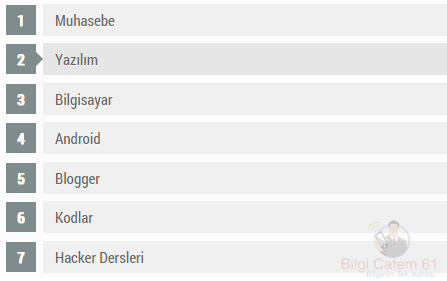
Numaralı Liste Nasıl Oluşturulur eklentisinin Özelliği hover efekti ile oluşturulan maddelerin Üzerine gelindiğinde resimde de gördüğünüz gibi ok işareti belirir de değiştiğini göreceksiniz renkinin ok işareti beliren Maddenin arka planı ettik.

     Numaralı Liste Nasıl Oluşturulur? Sitemize nasıl ekleyebiliriz Blog?

* Kumanda Paneli> Şablon> HTML'yi düzenle sıralamasını takip ediyoruz.
* CTRL + F kısa yol tuşları ile altta ki kodu aratıyoruz.
1..
]]></b:skin>
Bazi temaların kodlama özelliğine göre degişiklik gösterebilir.Bunun için altta ki kodlardan birini aratarak arasına css kodlarını ekliyoruz.
2.
<style></style>kodları içine alıp  <head> ile </head> arasına ekleyebilirsiniz.
(]]></b:skin>) kodunu bulduktan sonra hemen üst kısmına altta ki kodları ekleyerek şablonu kaydedin.

CSS KODLARI:
/* BC61/KOM Kodlarla Mücadele Numaralı Liste
----------------------------------------------*/
ol {counter-reset:li;list-style: none;font:15px 'Roboto Condensed', 'Oswald';
padding:0;margin-bottom:4em;text-shadow: 0 1px 0 rgba(255,255,255,.5);}
ol ol {margin: 0 0 0 2em;}
.post ol li{position:relative;display:block;padding:.4em .4em .4em .8em;
margin:.5em 0 .5em 2.5em;background:#F0F0F0;color:#666;text-decoration:none;
transition:all .3s ease-out;}
.post ol li:hover{background:#E6E6E6;}
.post ol li:before{content:counter(li);counter-increment:li;position:absolute;
left:-2.5em;top:50%;margin-top:-1em;background:#7F8C8D;color:#fff;height:2em;width:2em;
line-height:2em;text-align:center;font-weight:bold;}
.post ol li:after{position:absolute; content:'';border: .5em solid transparent;
left:-1em;top:50%;margin-top:-.5em;transition:all .3s ease-out;}
.post ol li:hover:after{left:-.5em;border-left-color:#7F8C8D;}
.post ol li span{position:relative;display:block;padding:5px 8px;margin-bottom:10px;background:#fafafa;color:#666;text-decoration:none;transition:all .3s ease-out;}
.post ol li span:hover{background:#f9f9f9;}

Kullanımı konusunda bilgi vereyim;
  1.   Oluştur kısmından makalenizi yazarken maddeler halinde olusturmak istediğiniz başlıkları  alt alta yazıyorsunuz.
  2.   Daha sonra altta ki resimde yeşil  2 numaralı işaretli kısımdan numaralı liste seçeneğine tıklıyoruz.


Blogumuza Abone Olun
Yeni Yazılar e-posta Adresinize Gelsin
Not: Gelen Maili Aktif  Etmeyi Unutmayınız!

24 Mayıs 2015 Pazar

Google Custom Search Box CSS3 Gezinti Çubuğu

 
   Google Custom Search Box CSS3 Gezinti Çubuğu sabit menülere Sahip, facebook, twitter ettik RSS abonelik butonlarının yanı Sıra arama motoru da mevcuttur.Menülere ait başlıkları ona zaman ki gibi Kendinize Göre works.

   Google Custom Search Box CSS3 Gezinti Çubuğu sitemize Eklemek İçin;
* Kumanda Paneli> Şablon sırlamasını izleyelim.
* Daha Sonra HTML düzenle kısmına Tıklayarak temamızın kodlarına ulaşmış oluyoruz.

   Şimdi yapmamız Gereken CSS Kodlarını temamıza tanıtmak Javascript
Eklendi bunun CTRL + F Click Tuşları ile altta ki kodu Aradip bulalım.
]]></b:skin>
Üste ki kodu bulduktan Sonra hemen Üst kısmına altta ki CSS Kodlarını ekleyerek Değişiklikleri kaydedin.
# Btrix1nav {border: none 5px # 000000;
-moz-border-radius-topleft: 15px;-moz-border-radius-topright:14px;-moz-border-radius-bottomleft:14px;-moz-border-radius-bottomright:14px;-webkit-border-top-left-radius:15px;-webkit-border-top-right-radius:14px;-webkit-border-bottom-left-radius:14px;-webkit-border-bottom-right-radius:14px;

2px 5px # 000000 3px; -webkit-box-shadow: 2px 5px # 000000 3px; box-shadow: 2px # 000000 5px 3px;
genişliği: 900px;
margin: 0 0 0 0px;
padding: 12px 0 8px 0;
clear: both;
background: # 696969 sol alt no-repeat; }
# Btrix1nav .catList {padding: 35px 0 0 4px; yüzer: Sol; margin-top: -3px; }
# Btrix1nav .pageList {padding: 0px 8px 0 0; yüzer: hakkı; }
# Btrix1nav ul li {float: left; marjı: 0 18 pikselden 0 0;}
{: #fff; List-style: none renk; text-decoration: none;} # Bir btrix1nav
# Btrix1nav a: hover {color: # 919191;}
# Btrix1nav li {list-style: none; text-decoration: none;}
#search {margin: 20px 0 -2px 0; yüzer: hakkı; }
#updatesBox {margin-left: 100px; }
Şimdi tekrar kumanda paneline geri dönelim ettik ikinci Işlem Click şunları Yapın.
* Kumanda Paneli> Yerleşim> Gadget ekle Yolunu izleyin.
* HTML / Javascript sıralamasını bulup altta ki menü HTML Kodlarını ekleyerek gadgeti kaydedin.
* Görünmesini İstediğiniz Kisima gadgeti sürükleyerek BıRakın Değişiklikleri kaydedin ettik.
<Div class = "Clearfix" id = "btrix1nav">
<Ul class = "CatList">
<Li class = "kedi-madde kedi madde-5"> <a href="#"> Ev </a> </ li>
<Li class = "kedi-madde kedi madde-3"> <a href="#"> Yüklemeler </a> </ li>
<Li class = "kedi-madde kedi madde-6"> <a href="#"> Araçları </a> </ li>
<Li class = "kedi-madde kedi madde-4"> <a href="#"> CSS3 </a> </ li>
<Li class = "kedi-madde kedi madde-4"> <a href="#"> HTML </a> </ li>
<Li class = "kedi-madde kedi madde-4"> <a href="#"> İpuçları </a> </ li>
<Li class = "kedi-madde kedi madde 31"> <a href="#"> Hakkında </a> </ li>
<Li class = "kedi-madde kedi madde-11"> <a href="#"> Bize </a> </ li>
</ Ul>
<Div id = "arama">
<Form action = "http://www.google.com/cse" id = "cse-arama-box" target = "_ blank">
<Div>
<Input name = "cx" type = "gizli" value = "004972222991511809341: kobh4_l5t3m" />
<Input name = "yani" type = "gizli" value = "ISO-8859-1" />
<Input class = "googleSearchField" name = "q" size = "20" style = "background-color: white; background-image: url (http://www.google.com/cse/intl/en/images/ google_custom_search_watermark.gif); background-position: 0% 50%; background-repeat: no-tekrar no-repeat; border: 1px solid rgb (126, 157, 185); padding: 2px; " type = "text" />
<Input class = "button" name = "sa" type = value = "Ara" "Gönder" /> </ div>
<Input name = "siteurl" type = "gizli" value = "bloggertrix.com/" /> <input name = "ref" type = "gizli" value = "" /> <input name = "ss" type = " gizli "value =" "/> </ form>
<Script src = "http://www.google.com/cse/brand?form=cse-search-box&lang=en" type = "text / javascript"> </ script>
</ Div>
<Div id = "updatesBox">
<Bir alt = class = "updatesIcon" href = "http://feeds.feedburner.com/" RSS Abone " bilgicafem61 tarzı "RSS Abone" = "target =" _ blank "title =" margin-left: 80px; "> <img style = ""> </a>
<a alt="Follow Us" class="updatesIcon" href="http://twitter.com/ bilgicafem61 "target="_blank" title="Follow Us"> <img /> </a>
<a alt="Become bir Fan" class="updatesIcon" href="http://www.facebook.com/ bilgicafem61 "target="_blank" title="Become bir Fan"> <img /> <a </ Div>
</ Div>


Blogumuza Abone Olun
Yeni Yazılar e-posta Adresinize Gelsin
Not: Gelen Maili Aktif Etmeyi Unutmayınız!

18 Mayıs 2015 Pazartesi

Blogg RSS Takip Et Widget Eklentisi


Blogger sitenize ekleyebileceğiniz en güzel bir RSS takip widgeti.Sitenizin sağ alt kısmında buton şeklinde görünür ve üzerine tıkladığınızda yukarı doğru açılan e-posta abonelik kutusu sayesinde ana sayfanızın karmaşıklığını düzenleyerek ziyaretçilerinizin yazılarınızı takip etmelerini sağlayabilirsiniz.
Yükseklik ve genişlik değerlerinizi düzenleyerek kullandığınız temaya uyumlu hale getirebilirsiniz.
<style type="text/css">
/*<![CDATA[*/
#esgfollowSubscribe {background-color: #464646;width: 220px;color: #fff;position: fixed;z-index: 999999;right: 10px;bottom: 0;}
.followOpened {-webkit-border-radius: 2px 0 0;-moz-border-radius: 2px 0 0;border-radius: 2px 0 0;-webkit-box-shadow: 0 0 8px rgba(0, 0, 0, 0.5);-moz-box-shadow: 0 0 8px rgba(0, 0, 0, 0.5);box-shadow: 0 0 8px rgba(0, 0, 0, 0.5);}
.esgfollowButton {background: #464646;color: #CCC !important;font-size: 13px;line-height: 28px;padding: 0 10px;text-decoration: none;position: absolute;top: -28px;right: 0;display: block;-webkit-box-shadow: 0 -1px 5px rgba(0, 0, 0, 0.2);-moz-box-shadow: 0 -1px 5px rgba(0, 0, 0, 0.2);box-shadow: 0 -1px 5px rgba(0, 0, 0, 0.2);-webkit-border-radius: 2px 2px 0 0;-moz-border-radius: 2px 2px 0 0;border-radius: 2px 2px 0 0;height: 28px;}
.esgfollowButton span {background: url("https://blogger.googleusercontent.com/img/b/R29vZ2xl/AVvXsEi_HPkhe8To8bMO6_3NkfDYD9YmOT8Vss6ZWbafAaNbmVUrMPS2T8YGGA5hiAV3XMRY3qQjP9w5GmR62jYX_Nf9Aeg3ATdnX6lJwLCcO8WvZaDpEXwJOclnQfXzMgPu-Jc9V5N0e75Nkbk/s1600/follow-bloggertrix.png") no-repeat scroll 0 3px transparent;padding-left: 15px;}
.esgfollowButton:hover,.followActive {color: #fff !important;}
.esgfollowButton:hover span,.followActive span {background-position: 0 -37px !important;}
.followactive {background-color: #333;}
.esgfollowForm {padding: 15px;}
.esgfollowForm h3 {font-size: 18px;margin: 0 0 10px;font-weight: normal;}
.esgfollowForm p {margin: 0 0 10px;}
.esgfollowForm .emailInput {width: 95%;padding: 2px 4px;margin: 0 auto;-webkit-border-radius: 3px;-moz-border-radius: 3px;border-radius: 3px;font-size: 15px;border: 1px solid #444;color: #888;display: block;clear: both;}
.esgfollowForm form {text-align: center;}
.esgfollowForm .emailInput:focus {color: #000;border-color: #000;}
.esgfollowForm .emailSubmit {cursor:pointer;padding: 2px 20px;background: #333;background: -webkit-linear-gradient(top, #333 0%, #111 100%);background: -moz-linear-gradient(top, #333 0%, #111 100%);background: -o-linear-gradient(top, #333 0%, #111 100%);background: -ms-linear-gradient(top, #333 0%, #111 100%);background: linear-gradient(top, #333 0%, #111 100%);color: #ccc;text-shadow: 0 1px 0 #000;border: 1px solid #282828;-webkit-border-radius: 11px;-moz-border-radius: 11px;border-radius: 11px;-webkit-box-shadow: inset 0 1px 0 #444;-moz-box-shadow: inset 0 1px 0 #444;box-shadow: inset 0 1px 0 #444;text-decoration: none;-webkit-transition: all 0.25s ease-in-out;-moz-transition: all 0.25s ease-in-out;-o-transition: all 0.25s ease-in-out;-ms-transition: all 0.25s ease-in-out;transition: all 0.25s ease-in-out;margin: 1em 0 1em 0;}
.emailSubmit:hover {background: #222;background: -webkit-linear-gradient(top, #333 0%, #222 100%);background: -moz-linear-gradient(top, #333 0%, #222 100%);background: -o-linear-gradient(top, #333 0%, #222 100%);background: -ms-linear-gradient(top, #333 0%, #222 100%);background: linear-gradient(top, #333 0%, #222 100%);color: #fff;-webkit-box-shadow: inset 0 1px 0 #4f4f4f;-moz-box-shadow: inset 0 1px 0 #4f4f4f;box-shadow: inset 0 1px 0 #4f4f4f;text-decoration: none;}
.emailSubmit:active {background: #111;background: -webkit-linear-gradient(top, #111 0%, #222 100%);background: -moz-linear-gradient(top, #111 0%, #222 100%);background: -o-linear-gradient(top, #111 0%, #222 100%);background: -ms-linear-gradient(top, #111 0%, #222 100%);background: linear-gradient(top, #111 0%, #222 100%);color: #aaa;-webkit-box-shadow: inset 0 -1px 0 #333;-moz-box-shadow: inset 0 -1px 0 #333;box-shadow: inset 0 -1px 0 #333;text-decoration: none;}
.esgFollowFooter {text-align: center;font: normal 11px "Helvetica Neue", sans-serif;padding: 7px 0;margin: 0 0 -15px !important;border-top: 1px solid #3c3c3c;}
.esgFollowFooter a {color: #aaa;text-shadow: 0 1px 0 #262626;background: none;text-decoration: none;}
.esgFollowFooter a:hover {color: #fff;background: none;}
/*]]>*/
</style>

<script type="text/javascript">
/*<![CDATA[*/
;(function(esg){esg(document).ready(function(){esg.extend(esg.easing,{easeOutCubic:function(x,t,b,c,d){return c*((t=t/d-1)*t*t+1)+b}});var followBox=esg("#esgfollowSubscribe");var followHeight="-"+followBox.outerHeight()+"px";followBox.hide().css({bottom:"-500px"});setTimeout(function(){followBox.show().animate({bottom:followHeight})},500);esg(".esgfollowButton").click(function(e){if(followBox.hasClass("followOpened")){esg(this).removeClass("followActive");followBox.removeClass("followOpened").stop().animate({bottom:followHeight},{duration:300,easing:"easeOutCubic"})}else{esg(this).addClass("followActive");followBox.addClass("followOpened").stop().animate({bottom:"0"},{duration:500,easing:"easeOutCubic"})}e.preventDefault()})})})(jQuery);
/*]]>*/
</script>
<div id="esgfollowSubscribe" style="bottom: -971px;">
<div class="esgfollowForm">
<a class="esgfollowButton" href="#" title="Follow"><b>+ Takip et</b></a>
<center>
<h3>Bilgi Cafem61 takip</h3>

Ücretsiz E-posta Güncellemeleri alın
</center>
<form action="http://feedburner.google.com/fb/a/mailverify" method="post" onsubmit="window.open('http://feedburner.google.com/fb/a/mailverify?uri=e-bilgicafem61', 'popupwindow', 'scrollbars=yes,width=550,height=520');return true" target="popupwindow">
<input class="emailInput" name="email" placeholder="Enter Your Email..." type="text" />
<input name="uri" value="bilgicafem61" type="hidden" />
<input name="loc" value="en_US" type="hidden" />
<input class="emailSubmit" value="Gönder" type="submit" />
</form>
<div class="esgFollowFooter">
<a href="http://etralibela-61.blogspot.com/" target="_blank">Delivered by Mustafa Kaba</a><a href="http://etralibela-61.blogspot.com/" target="_blank"> I Bu Widgeti alın</a>
</div>
</div>
</div>
<script src="https://ajax.googleapis.com/ajax/libs/jquery/1.7.1/jquery.min.js">
</script>


Blogumuza Abone Olun
Yeni Yazılar e-posta Adresinize Gelsin

Blogger İçin Güzel Rss Abonelik Kutusu


   Bu makalemizde web siteleri ve bloglar için sade ve güze bir e-posta RSS abonelik kutusu.Ayrıca HTML ve CSS kullanarak tasarladığımız bu RSS abonelik kutusu kendi isteğinize göre düzenleyebilirsiniz.

   Kumanda paneli > Yerleşim > Gadget ekle > HTML/Javascript sıralamasını izleyerek aşağıda ki kodları ekleyin ve görünmesini istediğiniz kısıma gadgeti sürükleyerek bırakın.

   NOT : Kod içerisinde yer alan mavi renkli yazılı bilgicafem61 yerine kendi RSS abonelik kullanıcı adresinizi yazınız.
<style>

.bordered {
border: solid #ff7417 2px;
-moz-border-radius: 8px;
-webkit-border-radius: 8px;
border-radius: 8px;
-webkit-box-shadow: 0 1px 1px #ccc;
-moz-box-shadow: 0 1px 1px #ccc;
box-shadow: 0 1px 1px #ccc;
}
.bordered2 {
height: 25px;
background-color: #ff7417;
-webkit-border-top-left-radius: 6px;
-khtml-border-radius-topleft: 6px;
-moz-border-radius-topleft: 6px;
border-top-left-radius: 6px;
-webkit-border-top-right-radius: 6px;
-khtml-border-radius-topright: 6px;
-moz-border-radius-topright: 6px;
border-top-right-radius: 6px;
text-shadow: 0 1px 0 rgba(255,255,255,.5);
border-top: solid #ffffff 1px;
}
</style>
<div class="bordered">
<div class="bordered2">
<center>
<span style="color: #ffffff; font-size: 16px;"><b>Subscribe Now</b></span></center></div>
<a href="http://feeds2.feedburner.com/bilgicafem61" rel="alternate" title="Subscribe now to avail the unthinkable" type="application/rss+xml"><img border="0" alt="" style=" padding-bottom:20px; margin: 0pt 10px 10px 0pt; float: left; width:100px; height:100px;" src="https://blogger.googleusercontent.com/img/b/R29vZ2xl/AVvXsEi1WI9mztejtWsMCCblK01C-LroU7rih7_oUz4PdAwc7SpXlQU-I5JiA08PUN9B5E5iF9fLH58Q2WWoKO7wst9xHnqNnSqKJw9nUCOjRKKk-VEOXpitl_QoBC0-OOOGMwwWvhLXovku35Q/s1600/RSS-Reader-Book-icon.png"/></a><p><a href="http://feeds2.feedburner.com/bilgicafem61" rel="alternate" title="Subscribe to my feed" type="application/rss+xml">Ücretsiz e-posta güncellemelerini alın.</a><span style="color: #ffffff; font-weight: bold;">e-posta adresinizi yazınız.</span></p>
<style>
input.bt {
color:#fff;
font: bold 10px Arial, sans-serif;
background:#F39100;
border:0;
padding:3px;

}
input.bthov {
color:#fff;
font: bold 10px Arial, sans-serif;
border:2px solid #F39100;
padding:3px;
}
</style>
<form action="http://feedburner.google.com/fb/a/mailverify" style="padding: 5px; " target="popupwindow" method="post" onsubmit="window.open('http://feedburner.google.com/fb/a/mailverify?uri=bilgicafem61', 'popupwindow', 'scrollbars=yes,width=550,height=520');return true"><input style=" color:#ffffff; background: #fff; border:1px solid #ff7417; width: 90px;" name="email" type="text"/>
<input value="bilgicafem61" name="uri" type="hidden"/><input value="en_US" name="loc" type="hidden"/> <input onmouseover="this.className='bt bthov'" onmouseout="this.className='bt'" value="Gönder!" class="bt" type="submit"/></form><br/>
</div>


Blogumuza Abone Olun
Yeni Yazılar e-posta Adresinize Gelsin
Not: Gelen Maili Aktif Etmeyi Unutmayınız!
14 Mayıs 2015 Perşembe

Blogger Sitre Üstü Sabit Bildiri Widget Eklentisi


   Blogger site üstü sabit bildiri bar widgedi sayesinde sitenizde yayınlamış olduğunuz en çok okunan yazınızı veya etiketi ekleyerek o etikete ait yazılarınızı belirtebilirsiniz.Widgetin diğer özelliği gizlenebilir olmasıdır.Sağ üst kenarında yukarı doğru belirtilmiş ok işaretine tıkladığınızda bildiri barı kapanır bu kez aşağı doğru ok işreti belirir.

   Kod içerisinde ki renkli işaretli kısımları kendi isteğinizi göre düzenlemeyi unutmayın.

<style>/*---Sabit bildirim bar  http://etralibela-61.blogspot.com/---*/#wg-rosebar {width:100%;height:100px;position:fixed;top:0;left:0;} #wg-rosebarbtm {border-bottom:3px solid #000;background-

color:#F60;overflow:none;width:100%;height:30px;position:fixed;top:0;left:0;} #wg-rosebarbtmdata {color:#fff;padding:5px;} #wg-rosebarbtmhide {position:absolute;top:4px;right:12px;width:20px;height:20px;cursor:pointer;} #wg-

rosebarbtmshow {position:absolute;top:0;right:5px;width:30px;height:25px;cursor:pointer;background-color:#F60;padding-top:5px;border-bottom:3px solid #000;border-left:3px solid #000;border-right:3px solid #000;border-bottom-

right-radius:5px;border-bottom-left-radius:5px;} .wg-rosebarbtmdownarrow {width:0;height:0;border-left:10px solid transparent;border-right:10px solid transparent;border-top:10px solid #CC5200;} .wg-rosebarbtmblock

{width:8px;height:10px;background-color:#CC5200;} .wg-rosebarbtmuparrow {width:0;height:0;border-left:10px solid transparent;border-right:10px solid transparent;border-bottom:10px solid #CC5200;}</style><div id="wg-rosebar"

><center id="wg-rosebarbtmshow" onmouseup="document.getElementById('wg-rosebarbtm').style.display='block'"><div class="wg-rosebarbtmblock"></div><div class="wg-rosebarbtmdownarrow"></div></center><div id="wg-

rosebarbtm" ><center id="wg-rosebarbtmhide" onmouseup="document.getElementById('wg-rosebarbtm').style.display='none'"><div class="wg-rosebarbtmuparrow"></div><div class="wg-rosebarbtmblock"></div></center><center

id="wg-rosebarbtmdata"><a href="http://etralibela-61.blogspot.com.tr/search/label/Hacker%20Dersleri">Mutlaka İnceleyin</a><b>Hacker Dersleri</b></center></div></div>


Blogumuza Abone Olun
Yeni Yazılar e-posta Adresinize Gelsin
Not: Gelen Maili Aktif Etmeyi Unutmayınız!

14 Nisan 2015 Salı

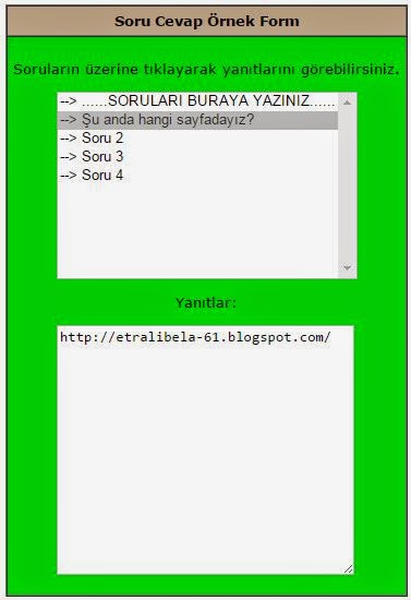
Blogger Soru Cevap Platform Eklentisi


Blogger sitenizde kullanabileceğiniz ve eminimdir böyle bir şey arayıp bulamadığınızı tahmin ediyorum.Bu eklentiyi kullanabilmek oldukça kolay ve kullanımı da o kadar kolay ve bir çok farklı amaçla kullanabilirsiniz.
Örneğin;
Ana sayfanızda gadget ekleme yöntemi ile size gelen en çok soruları ekleyerek cevapları ile yayınlayabilirsiniz.
Yada yazılarınız içerisinde de kullanabilirsiniz.
Soru cevap eklentisi renklerini ve tasarımını kod içerisinde bulup değiştirerek kendinize gire editleyerek kullanabilirsiniz.


<SCRIPT LANGUAGE="JavaScript">
function showFAQ(form) {
form.cevap.value = form.question.options[form.question.selectedIndex].value;
}
</SCRIPT>

<form name=faqform>
<table border=1 cellspacing=0 cellpadding=5>
<tr bgcolor="#BEA78B">
<td align=center><font face="verdana,arial" size="-1" color="#000000">
<b>Soru Cevap Örnek Form</b></font></td>
</tr>
<tr bgcolor="#lightyellow"><td><font face="verdana,arial" size="-1"><br>
<center> Soruların üzerine tıklayarak yanıtlarını görebilirsiniz.</center>
<p>
<ul><select size=10 name=question onChange="javascript:showFAQ(this.form);">
<option value="......CEVAPLARI BURAYI YAZINIZ......"> --> ......SORULARI BURAYA

YAZINIZ......
<option value="http://etralibela-61.blogspot.com/"> --> Şu anda hangi sayfadayız?
<option value="cevap 2"> --> Soru 2
<option value="Cevap 3"> --> Soru 3
<option value="Cevap 4"> --> Soru 4
</select>
</ul>
<p align="center">
Yanıtlar:
<p>
<ul>
<textarea name="cevap" rows=15 cols=36 wrap=virtual>

Eklentinin yükseklik ve genişlik boyutlarını kırmızı işaretli yerlerden düzenleyebilirsiniz.

Blogumuza Abone Olun
Yeni Yazılar e-posta Adresinize Gelsin
Not: Gelen Maili Aktif Etmeyi Unutmayınız!

22 Mart 2015 Pazar

CSS3 Dairesel Blogger Buton Eklentisi


   Blogger blogunuz için uyumu mause ile üzerine gelince hareketlilik kazanan buton eklentisini blogunuz da kullanmak isterseniz aşağıda ki uygulama anlatımını sırası ile izleyerek sizde blogunuza ekleyerek kullanabilirsiniz.

   CSS3 Dairesel Blogger Buton Eklentisi Kurulumu:

1. Blogger kumanda paneli - Şablon - HTML Düzenle yolunu izleyin
2. CTRL-F tuş kombinasyonu altta ki kodu aradın.
]]></b:skin>
3. Bulduğunuz üsteki kodun hemen üst kısmına altta ki kodları ekleyerek şablonu kaydedin.
.a-btn{
width:60px;
height:60px;
-webkit-border-radius:50%;
-moz-border-radius:50%;
border-radius:50%;
display:block;
margin:20px;
float:left;
background:#f0ad4e;
position:relative;
-webkit-box-shadow:0px 0px 5px 0px rgba(246, 212, 163, 0.5) inset, 0px -1px 5px 4px rgba(170, 77, 27, 0.2) inset, 0px 0px 0px 7px #fff, 0px 0px 1px 8px rgba(188, 188, 188, 0.4), 0px 0px 0px 9px #fff;
-moz-box-shadow:0px 0px 5px 0px rgba(246, 212, 163, 0.5) inset, 0px -1px 5px 4px rgba(170, 77, 27, 0.2) inset, 0px 0px 0px 7px #fff, 0px 0px 1px 8px rgba(188, 188, 188, 0.4), 0px 0px 0px 9px #fff;
box-shadow:0px 0px 5px 0px rgba(246, 212, 163, 0.5) inset, 0px -1px 5px 4px rgba(170, 77, 27, 0.2) inset, 0px 0px 0px 7px #fff, 0px 0px 1px 8px rgba(188, 188, 188, 0.4), 0px 0px 0px 9px #fff;
-webkit-transition:all 0.3s linear;
-moz-transition:all 0.3s linear;
-o-transition:all 0.3s linear;
transition:all 0.3s linear;
}
.a-btn span{
display:table-cell;
width:40px;
height:40px;
padding:10px;
text-align:center;
vertical-align:middle;
font-size:16px;
color:#fff;
text-shadow:0px 1px 1px #A03F16;
font-family:"Arvo", "Myriad Pro", "Trebuchet MS", sans-serif;
-webkit-transition:all 0.3s linear;
-moz-transition:all 0.3s linear;
-o-transition:all 0.3s linear;
transition:all 0.3s linear;
}
.a-btn span:nth-child(1),
.a-btn span:nth-child(3){
position:absolute;
top:0px;
left:0px;
font-size:16px;
line-height:19px;
opacity:0;
}
.a-btn span:nth-child(1){
background:transparent url(https://blogger.googleusercontent.com/img/b/R29vZ2xl/AVvXsEjT9uwC4fveJ82edMU4hKba6JbQeNPjvMFStqrhclvSsy1uIma_GHeCelqYpbf9LTk8vK7e1rzJtjNhk0LHayrET2dUYIxLYaxXKA5dd4NBAblpPTLrSBWS3bJOiGa53g5Tlt0RZlNcnzQ/s1600/star.png) no-repeat center center;
opacity:0.2;
}
.a-btn:hover{
background:rgba(170, 77, 27, 0.6);
-webkit-box-shadow:0px 0px 5px 0px rgba(246, 212, 163, 0.5) inset, 0px -1px 5px 4px rgba(170, 77, 27, 0.2) inset, 0px 0px 0px 7px #fff, 1px 4px 5px 8px rgba(188, 188, 188, 0.6), 0px 0px 0px 9px #fff;
-moz-box-shadow:0px 0px 5px 0px rgba(246, 212, 163, 0.5) inset, 0px -1px 5px 4px rgba(170, 77, 27, 0.2) inset, 0px 0px 0px 7px #fff, 1px 4px 5px 8px rgba(188, 188, 188, 0.6), 0px 0px 0px 9px #fff;
box-shadow:0px 0px 5px 0px rgba(246, 212, 163, 0.5) inset, 0px -1px 5px 4px rgba(170, 77, 27, 0.2) inset, 0px 0px 0px 7px #fff, 1px 4px 5px 8px rgba(188, 188, 188, 0.6), 0px 0px 0px 9px #fff;
}
.a-btn:hover span:nth-child(3){
opacity:1;
}
.a-btn:hover span:nth-child(2){
opacity: 0;
-webkit-transform: scale(0);
-moz-transform: scale(0);
transform: scale(0);
}
.a-btn:hover span:nth-child(1){
-webkit-animation:rotate 1s linear;
-moz-animation:rotate 1s linear;
animation:rotate 1s linear;
}
.a-btn:active{
-webkit-box-shadow:0px 0px 5px 0px rgba(246, 212, 163, 0.5) inset, 0px -1px 5px 4px rgba(170, 77, 27, 0.2) inset, 0px 0px 0px 7px #fff, 0px -1px 0px 8px rgba(188, 188, 188, 0.3), 0px 0px 0px 10px #fff;
-moz-box-shadow:0px 0px 5px 0px rgba(246, 212, 163, 0.5) inset, 0px -1px 5px 4px rgba(170, 77, 27, 0.2) inset, 0px 0px 0px 7px #fff, 0px -1px 0px 8px rgba(188, 188, 188, 0.3), 0px 0px 0px 10px #fff;
box-shadow:0px 0px 5px 0px rgba(246, 212, 163, 0.5) inset, 0px -1px 5px 4px rgba(170, 77, 27, 0.2) inset, 0px 0px 0px 7px #fff, 0px -1px 0px 8px rgba(188, 188, 188, 0.3), 0px 0px 0px 10px #fff;
}
.a-btn:active span:nth-child(2){
color:rgba(170, 77, 27, 0.8);
text-shadow:0px 1px 1px rgba(255, 255, 255, 0.6);
}
@keyframes rotate{
0% { transform: scale(1) rotate(0);}
50% { transform: scale(0.5) rotate(180deg);}
100% { transform: scale(1) rotate(360deg);}
}
@-webkit-keyframes rotate{
0% { -webkit-transform: scale(1) rotate(0);}
50% { -webkit-transform: scale(0.5) rotate(180deg);}
100% { -webkit-transform: scale(1) rotate(360deg);}
}
@-moz-keyframes rotate{
0% { -moz-transform: scale(1) rotate(0);}
50% { -moz-transform: scale(0.5) rotate(180deg);}
100% { -moz-transform: scale(1) rotate(360deg);}
}
4. Daha sonra kumanda paneli - Yerleşim - Gadget ekle - HTML/Javascript yolunu izleyerek buton kodlarını ekleyin ve düzenleyerek gadgedi kaydedin görünmesini istediğiniz yere sürükleyerek bırakın.
div class="button-wrapper">

<a href="#" class="a-btn"><span></span>
<span>Sign up</span>
<span>It's free!</span></a>

<a href="#" class="a-btn"><span></span>
<span>Join Now</span>
<span>It's free!</span></a>

<a href="#" class="a-btn"><span></span>
<span>Enter</span>
<span>It's free!</span></a>

<a href="#" class="a-btn">
<span></span>
<span>Get in</span>
<span>It's free!</span></a>
</div>
5. Kırmızı işaretli yerleri sizin istediğiniz gibi düzenleyebilirsiniz.


Blogumuza Abone Olun
Yeni Yazılar e-posta Adresinize Gelsin
Not: Gelen Maili Aktif Etmeyi Unutmayınız!

14 Mart 2015 Cumartesi

Blogger Yazılarda Açıklama Bilgi Verme Kodu


   Yazılarınızda açıklama bilgi verme veya yazı açıklamalarınızı kısaltma gibi ilk akla gelen seçenekler için bu kod size yardımcı olacaktır.Ayrıca geliştirebilir ve farklı özelliklerde de kullanılabilir bir özelliği de mevcut.


Blogumuza Abone Olun
Yeni Yazılar e-posta Adresinize Gelsin
Not: Gelen Maili Aktif Etmeyi Unutmayınız!

5 Mart 2015 Perşembe

Blogger Etiket Bazlı Arşiv Eklentisi


   Blogger sitenize site arşivi özellikli ve etiket bazlı arşiv eklentisini ekleyerek kullana bilirsiniz.Blogunuzda yer yeni yazınız bu eklenti güncellenerek eklenecektir anında ve yeni yazılarınız "New" kırmızı renkle belirtilmiş olacaktır.

Blogger Etiket Bazlı Arşiv Eklentisi blogumuza eklemek için sayfalarda yeni sayfa olarak ekleyin ve kod içerisinde http://etralibela-61.blogspot.com/ yerine sizin blog adresinizi yazın.

<link rel="stylesheet" href="http://dte-project.googlecode.com/svn/trunk/tabbed-toc-skin.css"/>
<div id="tabbed-toc"><span class="loading">Yükleniyor...</span></div>
<script>
var tabbedTOC = {
blogUrl: "http://etralibela-61.blogspot.com", // Blog URL
containerId: "tabbed-toc", // Container ID
activeTab: 1, // The default active tab index (default: the first tab)
showDates: false, // `true` to show the post date
showSummaries: false, // `true` to show the posts summaries
numChars: 200, // Number of summary chars
showThumbnails: false, // `true` to show the posts thumbnails (Not recommended)
thumbSize: 40, // Thumbnail size
noThumb: "data:image/png;base64,iVBORw0KGgoAAAANSUhEUgAAAAEAAAABCAIAAACQd1PeAAAAA3NCSVQICAjb4U/gAAAADElEQVQImWOor68HAAL+AX7vOF2TAAAAAElFTkSuQmCC", // A "no thumbnail" URL
monthNames: [ // Array of month names
"Januari",
"Februari",
"Maret",
"April",
"Mei",
"Juni",
"Juli",
"Agustus",
"September",
"Oktober",
"November",
"Desember"
],
newTabLink: true, // Open link in new window?
maxResults: 99999, // Maximum post results
preload: 0, // Load the feed after 0 seconds (option => time in milliseconds || "onload")
sortAlphabetically: true, // `false` to sort posts by published date
showNew: 7, // `false` to hide the "New!" mark in most recent posts, or define how many recent posts are to be marked
newText: " - <em style='color:red;'>New!</em>" // HTML for the "New!" text
};
</script>
<script src="http://dte-project.googlecode.com/svn/trunk/tabbed-toc.js"></script>


Blogumuza Abone Olun
Yeni Yazılar e-posta Adresinize Gelsin

4 Mart 2015 Çarşamba

Floating Social Media Widget Mouse Hover Effect


Sitenizde kullanabileceğiniz sosyal medya eklentisi sitenizin solunda örnek resimde`de gördüğünüz gibi sabit bir şekilde.

Bu eklentiyi sadece Html/Javascript olarak ekliyoruz yani yerleşim bölgesinden gadget ekle yolunu izleyerek sonra html/javascript olarak  sitemize ekliyoruz.

<style type="text/css">
ul#social {
position: fixed;
margin: 0px;
padding: 0px;
top: 10px;
left: 0px;
list-style: none;
z-index:9999;
}
ul#social li {
width: 100px;
}
ul#social li a {
display: block;
margin-left: -2px;
width: 100px;
height: 70px;
background-color:#fff;
background-repeat:no-repeat;
background-position:center center;
border:1px solid #AFAFAF;
-moz-border-radius:0px 10px 10px 0px;
-webkit-border-bottom-right-radius: 10px;
-webkit-border-top-right-radius: 10px;
-khtml-border-bottom-right-radius: 10px;
-khtml-border-top-right-radius: 10px;
-moz-box-shadow: 0px 4px 3px #000;
-webkit-box-shadow: 0px 4px 3px #000;
}
ul#social .twitter a{
background:#0F96C6 url(https://blogger.googleusercontent.com/img/b/R29vZ2xl/AVvXsEixl4uYhgoHcNfschtCU1tzXbm8pvAp38iOaixIoMoRvy97gksTbAsYtRXPsCe9d7JrNnzBkKPC_kEGhtmC55Jx_q5xbqrVc0Ha6FapGHZclVqLw7zhRJBJgTnJ6K7GwXsjvzkSdsATdTo/s1600/Twitter.png)no-repeat;
background-position:center center;
}
ul#social .googleplus a {
background:#D73D27 url(https://blogger.googleusercontent.com/img/b/R29vZ2xl/AVvXsEjpbVxqEISnYgM47rxIMRxejZxs3qm8vVN3TjMjwY3xk0SQlWpnP4H-gTI-NK3cyZFJQmI54XuZu2y-hOWp-BO7Akz4SFbPLjvKdWLfUEwsRu259jZ6iPHPeg10z0VWnXov-3JubUz4dZg/s1600/GOOGLE+PLus.png)no-repeat;
background-position:center center;
}
ul#social .facebook a {
background:#1A4B97 url(https://blogger.googleusercontent.com/img/b/R29vZ2xl/AVvXsEgIMcHEMhToOksDd8aVhGezPb55bPBP4pMiB3cstFIpRZp0XlgtqrORoJajgw8yfVCM1UGyIEqWEd0GMAmjLvIocpAIm4hJ7ikurK8uyIfJcDgqOV4yd7eyq9ilKKaL7P9sKwzF1AcP9rY/s1600/Facebook.png)no-repeat;
background-position:center center;
}
ul#social .rss a {
background:#FAAE17 url(https://blogger.googleusercontent.com/img/b/R29vZ2xl/AVvXsEjDSBXIrtR8YQT3DaKSDpk3DHbF2WRC5ren9b7fNAYX9QMJJN5VnmNtqkUwUdNQMu1rWxvCUcuQIdcvjDV4bzH3rPdW4lplnJmAQ8DaSde0jZbtTzHKcZJVoXO8oMQENeMNMZdhyphenhyphen1lGyDo/s1600/rss.png)no-repeat;
background-position:center center;
}

ul#social .pinterest a {
background:#963336 url(https://blogger.googleusercontent.com/img/b/R29vZ2xl/AVvXsEhJGFcKxq4P6JfmyTLsgSFupVjDoQ4IQAo7cNcuKqrh2EdSIJKSRPuQjZEMc_fTCaz4bpHHIpCGBIfSLTiTvQnby5aK8UJ2luXInjKVQLAuI34C1TwqsWwb0PrdUZqr4JRYto3EyVH46dM/s1600/Pinterest.png)no-repeat;
background-position:center center;
}
</style>

<script src="http://ajax.googleapis.com/ajax/libs/jquery/1.9.1/jquery.min.js"></script>

<script type='text/javascript'>
$(function () {
$('#social a').stop().animate({
'marginLeft': '-85px'
}, 1000);

$('#social > li').hover(
function () {
$('a', $(this)).stop().animate({
'marginLeft': '-2px'
}, 200);
},
function () {
$('a', $(this)).stop().animate({
'marginLeft': '-85px'
}, 200);
}
);
});
</script>
<ul id='social'>
<li class='twitter'><a href='#' title='Twitter'></a></li>
<li class='googleplus'><a href='#' title='Google Plus'></a></li>
<li class='facebook'><a href='#' title='Facebook'></a></li>
<li class='rss'><a href='#' title='Rss'></a></li>
<li class='pinterest'><a href='#' title='Pinterest'></a></li>

Not: yukarıda ki kodlarda KIRMIZI ile belirttiğim
bu kod daha önceden sitenizde ekliyse bu kodu eklemiyorsunuz ekli değilse o zaman bu kodu olduğu gibi ekliyoruz.

Mavi renkle işaretlemiş olduğum yerlere sizin adreslerinizi yazmayı unutmayın.


Blogumuza Abone Olun
Yeni Yazılar e-posta Adresinize Gelsin

Blogger Multi Sosyal Bar Eklentisi


Blogger sitenizde kullanabileceğiniz alt orta kısımda yer alan sosyal bar eklentide sosyal medya ve diğer popüler sitelerin yer aldığı farklı kısayol menüsü diyebiliriz.

Üste ki resimde gördüğünüz gibi kırmızı renkle işaretlediğim kısıma tıkladığınız da eklenti yukarı doğru açılır,ve eklenti içerisine farklı site kısayollarını da eklemek isterseniz yine yukarıda ki resimde "More" metnine tıklayın.

Blogger Multi Sosyal Bar Eklentisini sitemize Gadget ekleme yöntemi ile rahatlıkla ekleyebilirsiniz.

<a href="http://web.informer.com/button/providers/list"><img id="Webinformer_FavoritesButton_Button" src="http://s.web.informer.com/b2.gif" alt="Web Informer Button" style="border: 0" /></a></div><div><script src="http://s.web.informer.com/favorites-button.js?glass" type="text/javascript" charset="UTF-8"></script>


Blogumuza Abone Olun
Yeni Yazılar e-posta Adresinize Gelsin

2 Mart 2015 Pazartesi

Blogger - Kayan Resimli Son Yorumlar Eklentisi


   Blogger - Kayan Resimli Son Yorumlar Eklentisi blogunuzda Yapılan oğlu Yorumları gösterir.Eklentide ki yorum yapıldı Sayısını dilerseniz artırabilir VEYA azaltabilirsiniz.Ayrıca blogunuz da eklentinin görünmesini istediginiz Kisima gadgeti sürekleyerek BıRakın.

   Blogger - Kayan Resimli Son Yorumlar Eklentisini Blogger sitenize Gadget ekle method Ile ekleyerek kullanabilirsiniz.

<Marquee yön = yukarı scrollamount = "2" onmouseover = "this.scrollAmount = 0" onmouseout = "this.scrollAmount = 2"> <style type = "text / css">
ul.w2b_recent_comments {list-style: none; margin: 0; padding: 0;}

.w2b_recent_comments li {background: none önemli; margin: 0 0 6px önemli; padding:! açık:;; bloğu: Her iki; taşma: 0 0 6px 0 önemli ekran! gizli; list-style: none;}

.w2b_recent_comments li .avatarImage {padding: 3px; background: #none; -webkit-box-shadow: 0 1px 1px #ccc; -moz-box-shadow: 0 1px 1px #ccc, box-shadow: 0 1px 1px #ccc ; float: sol; margin: 0 6px 0 0; position: relative; taşma: gizli;}

.avatarRound {-webkit-border-radius: 100px; -moz-border-radius: 100px; border-radius: 100px;}

.w2b_recent_comments li img {padding: 0px; position: relative; taşma: gizli; display: block;}

.w2b_recent_comments li yayılma {margin-top: 4px; color: # 000000; display: block; font-size: 12px; font-style: italic; line-height: 1.4;}

</ Style>

<Script type = "text / javascript">

// <! [CDATA [

// Son Yorumlar Ayarlar

var

numComments = 5,

Gerçek showAvatar =

avatarSize = 60,

Gerçek roundAvatar =

karakter = 80,

sahte showMorelink =

moreLinktext = "Daha » ",

defaultAvatar = "https://blogger.googleusercontent.com/img/b/R29vZ2xl/AVvXsEgI2nG507V5ZEv9N20mb4zXm72JY0w9dOkEak06FJsciSkg3rTKHHHEEUaSkbECv5jKvzYLfg__hL1GKFxjnOrH2Patzfx48OT8sGOrmweJ2YCxdC9Tjr1sESvT1bY36RLwRXCtLFMvw-OA/s1600/comment.png"

hideCredits = false;

//]]>

</ Script>

<Script type = "text / javascript" src = "http://yourjavascript.com/211112512416/come.js"> </ script>

<Script type = "text / javascript" src="http://etralibela-61.blogspot.com/feeds/comments/default?alt=json&callback=w2b_recent_comments&max-results=5"></script></marquee>


Blogumuza Abone Olun
Yeni Yazılar e-posta Adresinize Gelsin
Not: Gelen Maili Aktif Etmeyi Unutmayınız!

24 Şubat 2015 Salı

Blogger İçin Toplam Yazı ve Toplam Yorum Eklentisi


Bu eklenti Sayesinde sitenizde kaç konu ziyaretinde yorum yapıldı oldugunu ziyaretçilere gösterebilirsiniz. Ziyaretçilerin bu Istatistikleri gormesi siteniz Hakkında Ölümlü Düşünce sağlayabilir. Buna benzer bir cok eklenti var. Buna benzer eklentiler sadece sadece yazı Şeklinde bu imkb görsellerle desteklenmiş. Yazı Şeklinde olanlar Daha sade gözüküyor. Böyle daha ilgi çekici ziyaretinde hoş olduğunu düşünüyorum.

Kurulumu oldukca kolay Gadget ekleme yöntemi ile Blogger sitenize ekleyerek görünmesini istediğiniz yere gadgeti sürükleyerek bırakın bu kadar.
<Script style = "text / javascript"> fonksiyonu numberOfPosts (json) {document.write ('<b>' + json.feed.openSearch $ totalResults $ t + '</ b> <br>'.);} Function numberOfComments (json) {document.write ('<span class = "Apple-style-yayılma" style = ""> </ span> <b>' + json.feed.openSearch $ totalResults. $ t + '</ b > <br> ');} </ script>

<Div class = 'kutu'> <div class = 'cell_1 konu-Sayısı'> <img class = 'simge' class = 'cell_2'> Toplam Konu </ div> <div class = 'cell_3'> <span class = 'sayısı' id = 'rss' /> <script
</ Script> </ span> </ div> </ div>

<Div class = 'kutu'> <div class = 'cell_1 yorum yapıldı-Sayısı'> <img class = 'simge' class = 'cell_2'> Toplam Yorum </ div> <div class = 'cell_3'> <span class = 'sayısı' id = 'rss' /> <script

<Style type = 'text / css'>
.box: hover {
Filtre: alfa (opaklık = 85); - moz-donukluk: .85; donukluk: .85;
}
.box img {
Sınır: 0;
padding: 0;

}
.Icon {
genişliği: 27px;
Yükseklik: 26px;
margin-top: 3px;
Sınır: yok;
}


.konu-Sayısı {
background-color: # 44B8F2;
background-image: -moz-lineer gradyan (üst, # 96DCFF, # 2BA6E3);
background-image: -ms-lineer-gradyan (üst, # 96DCFF, # 2BA6E3);
background-image: -webkit-gradyan (doğrusal, 0 0, 0% 100, gelen (# 96DCFF),) # 2BA6E3 (için);
background-image: -webkit-lineer gradyan (üst, # 96DCFF, # 2BA6E3);
background-image: -o-lineer gradyan (üst, # 96DCFF, # 2BA6E3);
background-image: doğrusal gradyan (üst, # 96DCFF, # 2BA6E3);
background-repeat: repeat-x;
Filtre: progid: DXImageTransform.Microsoft.gradient (startColorstr = '# FFA461', endColorstr = '# E8711A');
border-color: # da7c0c;
Renk: #fff;
text-shadow: 0 1px 1px RGBA (60, 60, 60, 0.75);
}

.yorum-Sayısı {
background-color: # F78634;
background-image: -moz-lineer gradyan (üst, # FFA461, # E8711A);
background-image: -ms-lineer-gradyan (üst, # FFA461, # E8711A);
arka plan görüntüsü: -webkit gradyan (doğrusal, 0, 0, 0,% 100, (# FFA461) için, (# E8711A) için);
background-image: -webkit-lineer gradyan (üst, # FFA461, # E8711A);
background-image: -o-lineer gradyan (üst, # FFA461, # E8711A);
background-image: doğrusal gradyan (üst, # FFA461, # E8711A);
background-repeat: repeat-x;
Filtre: progid: DXImageTransform.Microsoft.gradient (startColorstr = '# FFA461', endColorstr = '# E8711A');
border-color: # da7c0c;
Renk: #fff;
text-shadow: 0 1px 1px RGBA (60, 60, 60, 0.75);
}

.box {
font-family: "lucida grande", Tahoma, Verdana, Arial, sans-serif;
font-size: 17px;
line-height: 14px;
list-style-type: none;
display: inline-block;
padding: 0px 0px;
margin: 2px 5px;
color: # 333;
text-align: center;
text-shadow: 0 1px 1px RGBA (255, 255, 255, 0.75);
Filtre: Gölge (color = # 000000, yön = 135, gücü = 5);
text-decoration: none;
vertical-align: orta;
background-color: # f5f5f5;
Filtre: progid: DXImageTransform.Microsoft.gradient (startColorstr = '# ffffff', endColorstr = '# E6E6E6'); / * IE için * /
background-image: -moz-lineer gradyan (üst, #ffffff, # E6E6E6);
background-image: -ms-lineer-gradyan (üst, #ffffff, # E6E6E6);
background-image: -webkit-gradyan (#FFFFFF (doğrusal, 0 0, 0 100%),) # E6E6E6 (için);
background-image: -webkit-lineer gradyan (üst, #ffffff, # E6E6E6);
background-image: -o-lineer gradyan (üst, #ffffff, # E6E6E6);
background-image: doğrusal gradyan (üst, #ffffff, # E6E6E6);
background-repeat: repeat-x;
border-color: # E6E6E6 # E6E6E6 #BFBFBF;
border-color: RGBA (0, 0, 0, 0.1) RGBA (0, 0, 0, 0.1) RGBA (0, 0, 0, 0.25);
Sınır: 1px solid #CCC;
border-bottom-color: # B3B3B3;
-webkit-box-shadow: 0 1px 0 RGBA (255, 255, 255, 0.2), 0 1px 2px RGBA (0, 0, 0, 0.05) ilave;
-moz-box-shadow: 1px gömme 0 0 RGBA (255, 255, 255, 0.2), 0 1px 2px RGBA (0, 0, 0, 0.05);
kutu-gölge: gömme 0 1px 0 RGBA (255, 255, 255, 0.2), 0 1px 2px RGBA (0, 0, 0, 0.05);
İmleç: işaretçi;
position: relative;
margin-left: -1px;
şamandıra: Sol;
line-height: 20px;
şamandıra: Sol;
-webkit-border-radius: 4px;
-moz-border-radius: 4px;
border-radius: 4px;
}
.col_4 {
şamandıra: Sol;
}
.cell_1 {
şamandıra: Sol;
genişliği: 40px;
Yükseklik: 30px;
padding: 0px 0 0;
margin-left: 0;
}
.cell_2 {
border-right: 1px solid # ddd;
şamandıra: Sol;
genişlik: 186px;
Yükseklik: 25px;
text-align: center;
padding: 5px 0 0;
}
.cell_3 {
şamandıra: Sol;
genişliği: 50px;
Yükseklik: 25px;
text-align: center;
padding: 4px 0 0;
}
</ Style>


Blogumuza Abone Olun
Yeni Yazılar e-posta Adresinize Gelsin

22 Şubat 2015 Pazar

Blogger Resimli Son Yorumlar Eklentisi


   Daha ÖNCE  Avatarlı son Yorumlar eklentisi konusunu yayınlamıştık o yazımızda 3 Farklı SEÇENEK sunmuştuk.Şimdi bu yazımızda ki Verecek olduğum eklentide sadece sadece sadece sadece resimli oğlu ziyaretinde Yorumlar eklentisi yer'de alacaktır.Üsteki resimde ki Gibi Görünen bu eklentiyi Blogger siteniz ekleyecek Olduğunuz Yöntem Kısa kolaydır Ettik.

   Blogger Resimli Son Yorumlar Eklentisi Eklemek İçin Kumanda paneli> Yerleşim> Gadget ekle> HTML / JavaScript Yolunu izleyerek aşağıda ki kodları gadget içerisine ekleyerek kaydedin.

<Stil type = "text / css"> 
#komentar {background: #fff; Sınır: 1px solid # 8181F7; -moz-border-radius-bottomright: 10px; -moz-border-radius: 5px;
-webkit-border-radius: 5px;
-khtml-border-radius: 5px;
border-radius: 5px; margin: 5px 0; padding: 5px;}
#komentar ul {margin: 0; padding: 0px; list-style: none;}
ul li #komentar: first-child {border-top: hiçbiri;}
#komentar ul li {height: 46px; background: # A9D0F5; list-style-type: none; margin: 0 0 5px 0px; ! padding: 5px 5px 5px 5px önemli Diğer; font-size: 12px Önemli; font-weight: 550; Sınır: 1px solid # 8181F7; -moz-border-radius-bottomright: 10px; -moz-border-radius: 5px;
-webkit-border-radius: 5px;
-khtml-border-radius: 5px;
border-radius: 5px; margin: 5px 0; padding: 5px;}

ul li #komentar: oğul çocuk {border-bottom: hiçbiri;}
ul li #komentar: hover {background: #CCFFFF;
-moz-border-radius-bottomright: 10px; -moz-border-radius: 5px;
-webkit-border-radius: 5px;
-khtml-border-radius: 5px;
border-radius: 5px; margin: 5px 0; padding: 5px;}
Ziyaret: Bir #komentar, Bağlantı: Bir #komentar, bir, #komentar {clear: both; color: # 222; display: block; text-decoration: none;}
#komentar .gamen {display: block; şamandıra: Sol; Yükseklik: 42px; Sol: 4px; margin-right: 15px; position: relative; Genişliği: 42px;}
.gamen #komentar> img {border: 2px Katı #ffffff; -webkit-border-radius: 22px; -moz-border-radius: 22px; border-radius: 22px; kutu-gölge: 222222 2px 0 1px #; background: url (http://tipstrikblogging.googlecode.com/files/Avatar%20Blogger%20Comments.jpg) tekrar-x;}
#komentar ul li div.ismen {color: # 333; text-shadow: 1px -1px -1px #ccc;}
#komentar .ismen {display: block; font-size: 1em; font-style: italic; line-height: 1.2; padding: 2px 2px 0 4px;}
#komentar .gamen> span {width: 150px; Yükseklik: auto; line-height: 20px; padding: 5px; Sol: 115px; margin-left: -64px; font-size: 1em; font-weight: bold; color: # 212121; text-shadow: 1px 1px 1px RGBA (0, 0, 0, 0.1); text-align: center; Sınır: 4px Katı # 5858FA; background: RGBA (255,255,255,0.7); text-indent: 0px; Sınır -radius: 5px; position: absolute; işaretçi-olaylar: yok; alt: 100px; donukluk: 0; kutu-gölge: 1px 1px 2px RGBA (0,0,0,0.2); - Webkit-Geçiş: Tüm 0.3s Kolaylığı -in-out; -moz-Geçiş: Tüm 0.3s Kolaylığı-in-out, -o-Geçiş: Tüm 0.3s Kolaylığı-in-out; -MS-Geçiş: Tüm 0.3s Kolaylığı-in-out; Geçiş: tüm 0.3s Kolaylığı in-out;}
#komentar .gamen> span: önce, #komentar .gamen> span: ''; pozisyonu: {içerik Sonra mutlak; alt: -15px; Sol:% 50; margin-left: -9px; Genişlik: 0; Yükseklik: 0; border-left: 10px Katı şeffaf, sınır-right: 10px Katı şeffaf, border-top: 10px Katı RGBA (0,0,0,0.1);}
#komentar .gamen> span: {: -14px; margin-left: alt -10px; border-top: 10px # Katı 5858FA;} Sonra
#komentar .gamen: hover> span {donukluk: 0.9; alt:;} 55 piksel x
</ Style>
<Div id = "komentar">
<Ul>
<Script type = "text / javascript">
// <! [CDATA [
var jmlkomentar = 5;
60 = jmlkarakter var;
//]]> </ Script>
<Senaryo src = "http://tipstrikblogging.googlecode.com/files/RecentComment-W-Gravatar-Tooltip.js" type = "text / javascript"> </ script>
<Script type = "text / javascript"> </ script>
</ Ul>
</ Div>
<Küçük> </ small> <br />
<Div style = "font-size: 90%; text-align: right; text-shadow: 2px 2px 2px #adadad;">
<Küçük> </ small> </ div>


Blogumuza Abone Olun
Yeni Yazılar e-posta Adresinize Gelsin